I’ll get to my review of last night’s Design Star in a minute, but why would I rush to serve up crap on a silver platter when I can highlight good design? Turns out HGTV’s stale Design on a Dime has had a pretty amazing makeover, including a 150% increase in decorating budget (now $2,500/episode vs. $1,000 before) and a shiny, happy new host–Design Star Season 5 finalist, Casey Noble.
I find it interesting that in a down economy we’re upping the budget, but I’ll play along because even though I know we all want to get away with spending less, that $1,000 budget forced previous designer hosts to include a lot of tacky projects few people would want to repeat in their own homes.
Casey’s an engaging host, and some of the projects and tips showcased during this sneak peek episode are inspiring to even the most jaded designer. I will say, however, that I find it difficult to believe the average viewer will find many of these projects approachable enough to do themselves. Dipping curtains into bleach for an ombre effect is something most people can pull off successfully, regardless of their skill level. Yet, heading out to my backyard to throw chemicals on mirror tiles and torching them up? I don’t think I’ll do that anytime soon…at least not without having the fire department on speed dial. Having coffee tables and side tables welded? Don’t see most viewers doing that either.
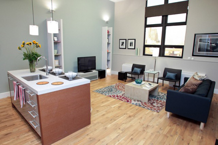
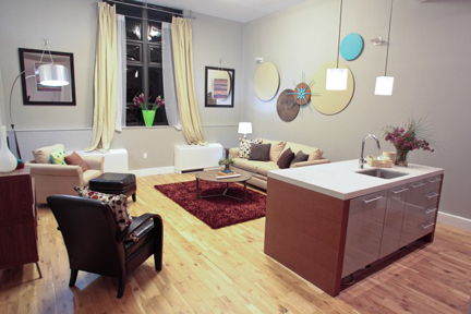
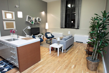
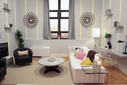
Still, when you compare last night’s Design Star and the episode of Design on a Dime that followed, all of the designers had a budget of $2,500 (nice segue between shows, HGTV) and some furniture to start with in both scenarios. Yet look at the crazy contrast in quality level between the two shows:
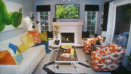
Casey Noble's first design as Design on a Dime host.
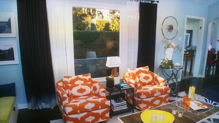
Casey Noble's slipcovered chairs and curtain panels dipped in bleach for an ombre effect.
I get that Casey had time to have slipcovers made for her furniture and order FLOR tiles for her rug. Those are definite advantages she has over the other four designers in this Design Star “Look for Less” challenge. But where is the life in these last four rooms? Why are we so hell bent on celebrating drab design? And why is every episode seemingly chock full of grayed-out rooms? Gray’s really hot and trendy right now and I’m cranking out some as we speak too, but when I look at these photos I see nothing but dishwater. There’s not enough striking contrast or telegenic color to keep me interested. All of the rooms flat out sucked, some more than others.
Here’s what didn’t suck:
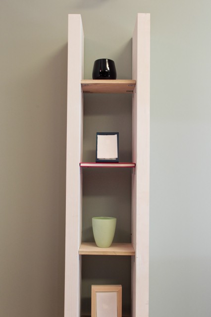
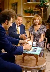
Karl’s bookshelves made out of books is brilliant. He’s taken something we’ve all seen a thousand times over and made it fresh and interesting–even a little like a decorative pun. This project reminds me of that episode of Seinfeld when Kramer made a coffee table book about coffee tables, with coffee table legs that unfolded beneath it:
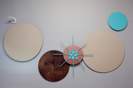
I also loved Kellie’s art made from wooden spoons and thought this wall deserved more brownie points than were given. I’ve done similar things with chopsticks–it’s a great DIY project and I love her turquoise-wood combo.
What also doesn’t suck? Karl’s bookshelf presentation on The Nate Berkus Show. Not only does he overcome serious jitters, but he makes Nate’s studio audience gasp with ooh’s and ahh’s when he shows them how to turn actual books into bookshelves. Does anyone else inspire such a response? No. Well…Meg does, but only because she guilts the audience into it by asking, “Where are my ooh’s and ahh’s?” Although that shows her ability to think quick on her feet, it is not as powerful as a genuine reaction.
I certainly don’t think Meg should win last night’s challenge (Karl would get my vote). Those West Elm basket-y things on the wall flanking the window look like operatic breast cages–to work, they need to be misaligned and/or grouped with other round objects. The overall color palette in the room is devoid of life, and those molding strips look hideous painted whatever fleshy yellow tone that is. I am agape when Nate compliments Meg on her color palette. Maybe I need beer goggles to see it.
Also, a note to any condo buildings considering the use of their units on a makeover show like Design Star: Don’t pick your most depressing-looking rooms for makeover material. The penthouse the finalists are seen living in promotes the building very well. There are ample windows and beautiful finishes. The units the designers worked on for this episode, on the other hand, look like basement apartments with tall ceilings. The issues the designers have in creating window treatments that work with this wonky window highlight it as a negative flaw and not a feature. Tall ceilings are great, but tall ceilings and one single, problematic window…why would anyone see that and think, that’s the apartment for me!
Next week, HGTV’s letting the remaining three finalists (regretably, we said goodbye to Kellie Clements last night) take over whole houses, and based on previous episodes, I am already sympathizing with the poor homeowners. I sincerely hope to eat these words, but it’s hard to be optimistic based on what we’ve seen so far this season.
